If you have visited google drive's upgrade page, this might be the thing you may noticed as a web developer.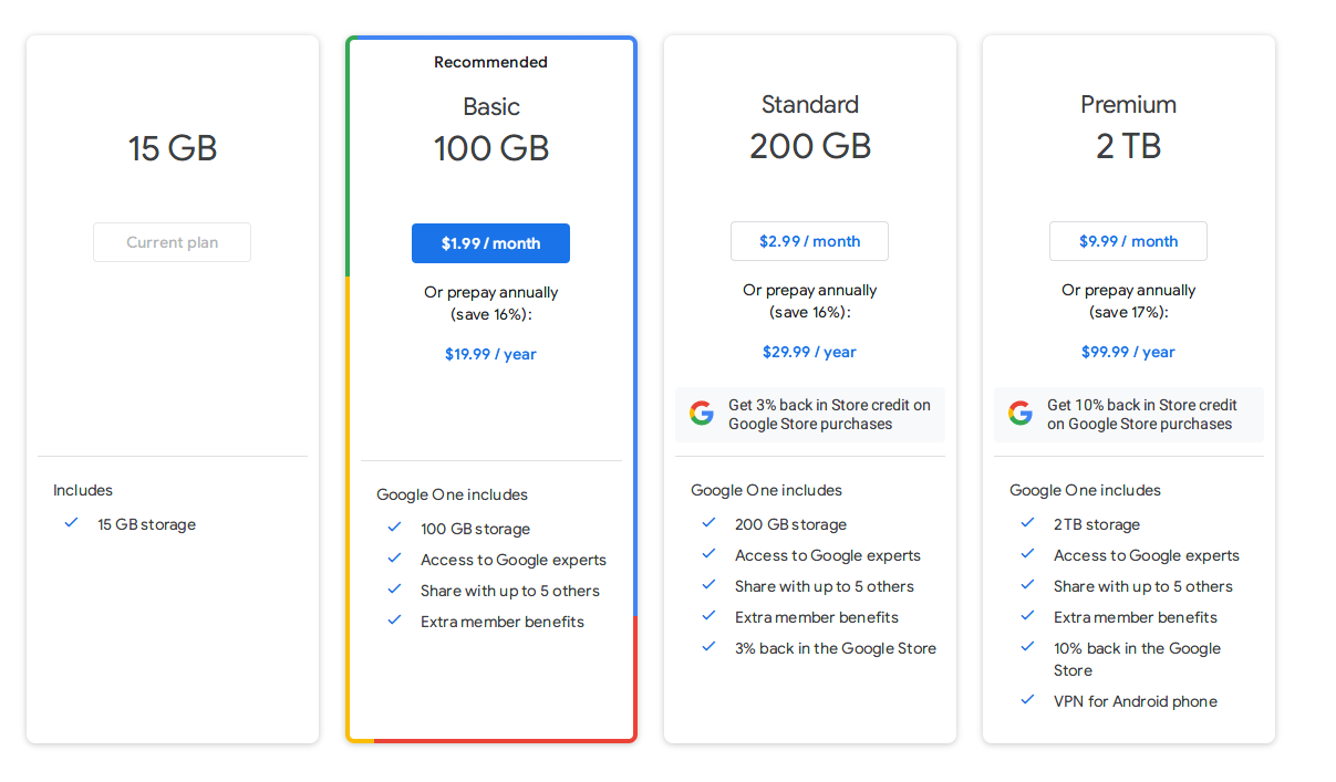
How do they make a border with 4 different and unevenly distributed colors? After digging into the design for a while, here is the trick.
After removing all the unnecessary covers on top of the div, this is what makes the border possible.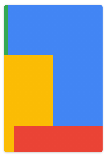
But still the question remains: what are all the rectangles? Are they DIVs put together? No, they are backgrounds carefully crafted to make them look like rectangles. And this is where the magic happens
.classname {
    background: linear-gradient(90deg,#34a853 4%,#4285f4 0%) top/100% 34% no-repeat,linear-gradient(90deg,#fbbc04 50%,#4285f4 0%) top/100% 82% no-repeat,linear-gradient(90deg,#fbbc04 10%,#ea4335 0%) top/100% 100%;
    border: 0;
}
With a little bit of color tweak, it's more obvious: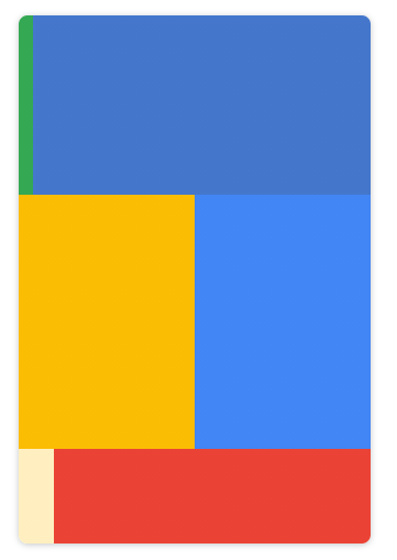
There are 3 stripes of background colors. Each of them consists of two non-cross-fade colors and every two rows have one color shared so that you won't notice it. And at last, cover the background with another white DIV inside and that's it!




0 comment