Continuously write down my CSS learning experiences, keep my memory fresh and it will help someone or anyone someday.
Difference between unitless and united line-height:
Full explanation: (MDN)line-height
Brief explanation:
it is a ratio: 1.5 means 1.5 times the font size of the element. So it means the same as 1.5em or 150%, but with one important exception: in inheritance, when a pure number is used, the number is inherited, not the computed value.
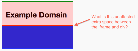
The mysterious gap after the iframe element.

You'll see an unexpected space between iframe and the element next to it.
This is because iframe is an inline element by default, which like the img tag, can have issues with whitespace. Setting display:block; on it turns the iFrame into a block element (like a div), which will remove the whitespace issue.
.border iframe {
    border: none;
    width: 300px;
    height: 100px;
    margin: 0;
    padding: 0;
    opacity: 0.8;
    display:block; /* Add this */
}
Set dot color of text-overflow: ellipsis
Having a css:
.container {
  width: 120px;
}

.text {
  white-space: nowrap;
  text-overflow: ellipsis;
  overflow: hidden;
}

.color {
  color: #b02b7c;
}
and html
<div class="container">
  <div class="text">Lorem <span class="color">ipsum dolor sit amet, consetetur</span>
  </div>
  <!-- works -->
  <div>Lorem <span class="text color">ipsum dolor sit amet, consetetur</span>
  </div>
  <!-- doesn't work -->
</div>
You would end up with text ellipsis dot in black:
The reason the ellipsis dots are in black is that the ellipsis is taking the color of the div, then make the div the color you want the ellipsis to be, and use .color to set the initial text black.
Change css and html to the following solves the problem.
.container {
    width:120px;
    background: lightgray;
}
.text {
    white-space: nowrap;
    text-overflow: ellipsis;
    overflow: hidden;
    color:#b02b7c;
}
.color {
    color: black;
}
<div class="container">
<div class="text"><span class="color">Lorem</span> ipsum dolor sit amet, consetetur
</div><!-- works -->
</div>Maintaining the final state at end of a CSS3 animation
When an animation ends, it returns to the state it began, without any transition. We can change the behavior and maintain the final state (i.e. the css of keyframe 100%)
animation-fill-mode: forwards;or use the shorthand:
animation: xx Ns forwards;Learn the all three possible options of the attribute here
Shrink content of flexbox
When using flex, a content expands when flex-grow is set, however, it may not be able to shrink back when page gets smaller even with theflex-shrink set.
This is because in flex layout, an initial setting on flex items is min-width: auto (and min-height: auto). This means that a flex item cannot, by default, be smaller than its content.
Overriding the default value to a smaller value fixes the problem:
div.class {
  min-width: 0;
}
>>Stackoverflow discussion 1<<
>>Stackoverflow discussion 2<<
>>W3C Flexbox Specification<<


0 comment